|
79Score
Getting your Trinity Audio player ready...
|
Understanding the PTE table chart can significantly boost your performance in the PTE Academic exam. This section tests your ability to interpret and describe various data represented in table charts, a skill that’s essential for academic and professional success. This covers a comprehensive template for structuring your responses, shares tips to maximize your score, and provides sample questions with answers to enhance your practice. By the end, you’ll feel more confident tackling the PTE table chart tasks. You can also practice with a free mock test of PTE and can check your preparation level.
PTE Table Chart Template
When dealing with a PTE table chart, having a clear template can streamline your response. Here’s a simple yet effective structure to follow:
- Introduction: Briefly summarize the chart’s content. Mention what type of data is presented and the time frame or categories involved.
- Main Features: Highlight the most significant trends or patterns in the data. Focus on notable increases, decreases, or stable points.
- Comparisons: If applicable, compare different categories or time periods. Discuss the differences and what they might imply.
- Conclusion: Provide a succinct summary of your observations. This can include potential implications or a personal insight based on the data.
Always aim for clarity and conciseness. The goal is to communicate the essence of the data effectively.
Tips to score high
Scoring well in the PTE table chart section requires not just knowledge but also strategy. Here are eight actionable tips to elevate your performance:
1. Understand the Chart Type
Different types of charts convey different information. Familiarize yourself with common types like bar charts, line graphs, and pie charts. Each one has unique features that can guide your description.
2. Focus on Key Trends
Pay attention to the most critical data points. Is there a noticeable trend? For example, if a line graph shows a steep rise, highlight that as a focal point in your description.
3. Use Specific Data
When possible, reference specific figures. Instead of saying “a significant increase,” state “an increase of 20%.” This precision enhances the credibility of your response.
4. Practice Time Management
During the exam, time management is important. Allocate time for planning your response, writing, and reviewing. Aim for clarity within the time limits.
Not sure where you stand? Take a free PTE mock and find out instantly

- Get a complete performance breakdown instantly
- Access 30,000+ Free Question Wise Practice
5. Avoid Unnecessary Jargon
While you want to use appropriate vocabulary, excessive jargon can confuse your reader. Stick to clear, straightforward language.
6. Use Transitional Phrases
To enhance the flow of your description, incorporate transitional phrases. Words like “however,” “in contrast,” and “also,” can guide the reader through your points.
7. Review Sample Answers
Familiarize yourself with high-scoring sample answers. Analyze what makes them effective. Look for structure, clarity, and how data is presented.
8. Practice Regularly
Consistent practice is key. Use practice tests and simulate exam conditions to build confidence and improve your skills.
PTE Table Chart Sample Questions and Answers
Let’s take a look at some sample questions from the PTE table chart section, along with model answers to give you a better idea of how to approach this task.
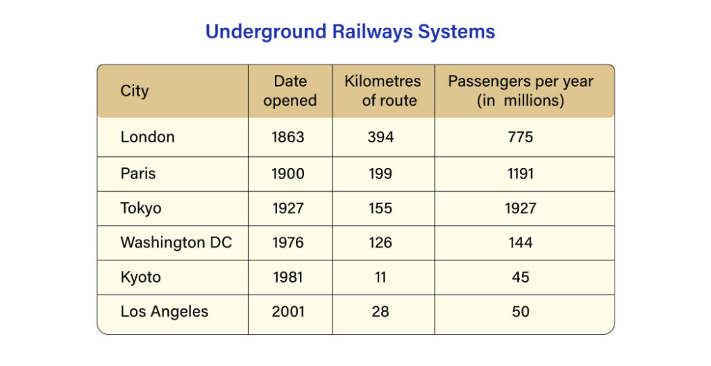
Sample Question 1
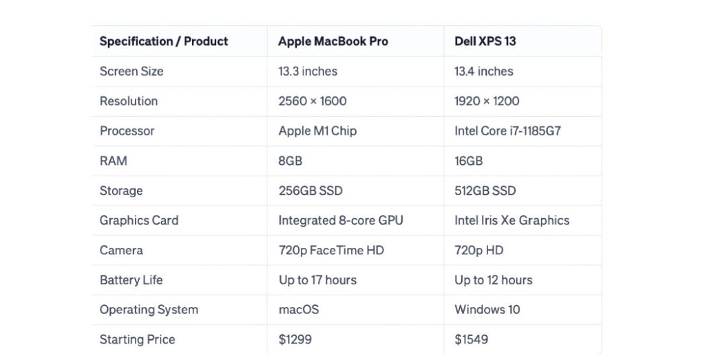
Sample Answer:
The table compares Apple MacBook Pro and Dell XPS 13 across key specifications. Both have similar screen sizes, 13.3 inches for MacBook and 13.4 inches for Dell, but the MacBook offers a higher resolution of 2560 × 1600 and longer battery life up to 17 hours. In contrast, Dell provides stronger memory and storage with 16GB RAM and 512GB SSD, although its starting price is higher at $1549 compared to $1299. Overall, the MacBook leads in display and battery, while Dell stands out for RAM and storage.
Sample Question 2
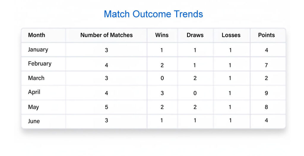
Sample Answer:
The table presents a monthly performance analysis of a sports team, showing the number of matches played, wins, draws, losses, and total points. April recorded the highest points (9), with 3 wins and 1 loss. May followed closely with 8 points from 5 matches. March had the lowest points (2), with no wins and two draws. Overall, performance fluctuated across months, with April being the most successful and March the weakest.
Sample Question 3
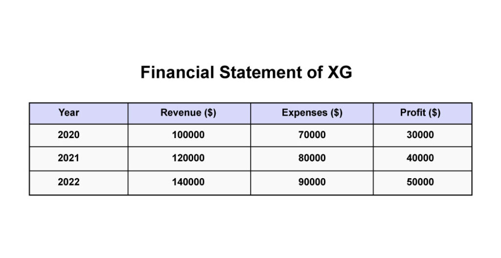
Sample Answer:
The table presents the financial statement of XG for 2020, 2021, and 2022, including revenue, expenses, and profit in dollars. Revenue increases steadily from $100,000 to $120,000 and then $140,000. Expenses also rise from $70,000 to $80,000 and reach $90,000 in 2022. As a result, profit grows consistently from $30,000 to $40,000 and finally $50,000. Overall, the data indicates strong financial growth, with revenue rising faster than expenses and profit improving each year.

Sample Question 4

Sample Answer:
The table shows a middle school timetable from Monday to Friday, covering eight periods from 08:00 to 15:40, with a lunch break from 12:35 to 14:00. Core subjects like Math and English appear multiple times across the week, especially in the morning sessions. Science-related classes such as Physics, Biology, and Chemistry are also frequent, while practical subjects include P.E., Art, Music, and Computer Science. Afternoons often mix skill-based lessons with lighter subjects. Overall, the schedule balances academic learning with creative and physical activities throughout the school week.
Sample Question 5:
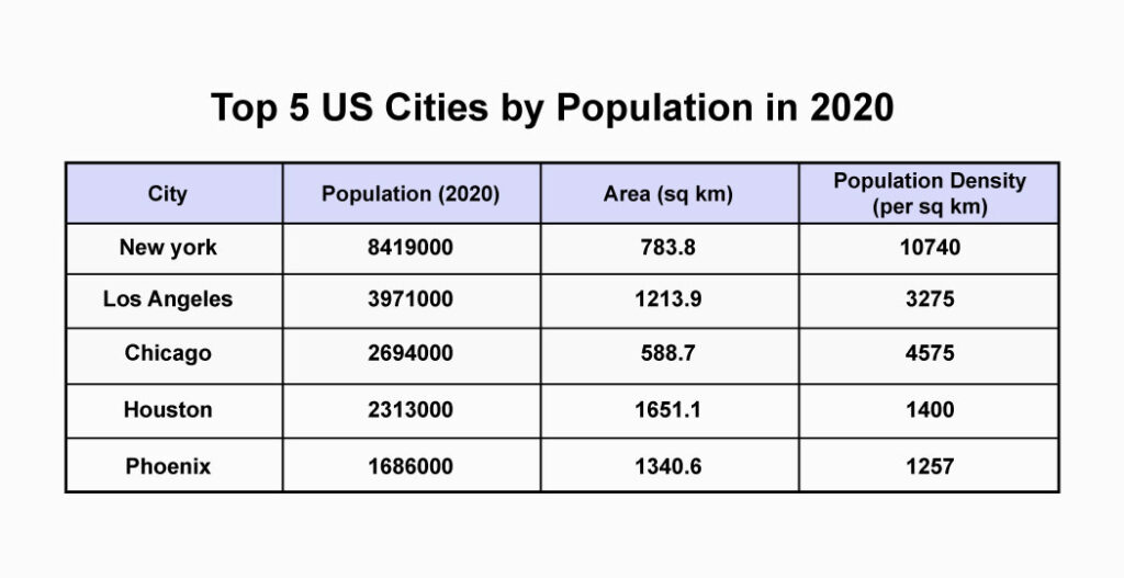
Sample Answer:
The table shows the top five US cities by population in 2020, along with area and population density. New York leads with 8,419,000 people and the highest density at 10,740 per sq km, despite a smaller area of 783.8 sq km. Los Angeles has 3,971,000 residents with a much larger area of 1,213.9 sq km and a density of 3,275, while Chicago records 2,694,000 and a density of 4,575. Phoenix is the least populated at 1,686,000 and also has the lowest density at 1,257. Overall, New York dominates in both population and density compared to the other cities.
Sample Question 6:
Sample Answer:
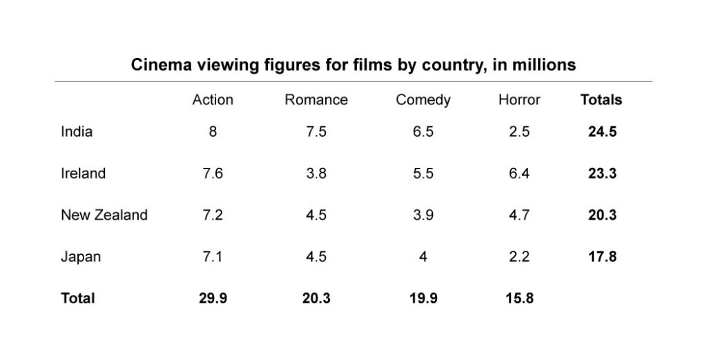
The table presents cinema viewing figures by genre in four countries, measured in millions. India has the highest total at 24.5, followed closely by Ireland 23.3, then New Zealand 20.3, and Japan 17.8. Across genres, Action is the most watched overall at 29.9, while Horror is the lowest at 15.8. India leads in romance and comedy, whereas Ireland records a notably high horror figure at 6.4. Overall, India has the largest audience, and action films are the most popular category.
Sample Question 7:
Sample Answer:
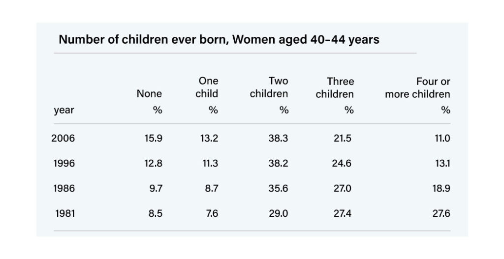
The table illustrates changes in the number of children born to women aged 40–44 between 1981 and 2006. Over time, the percentage of childless women nearly doubled from 8.5% to 15.9%, while those with four or more children declined sharply from 27.6% to 11%. Two-child families remained the most common throughout. Overall, the data indicates a shift toward smaller family sizes and increasing childlessness.
Sample Question 8:
Sample Answer:
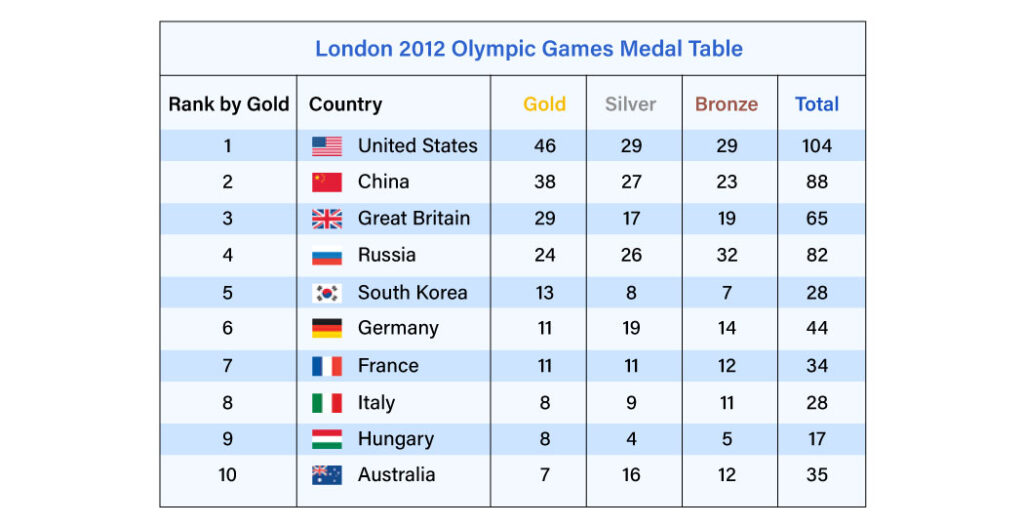
The table lists the top ten countries in the 2012 London Olympics ranked by gold medals. The United States topped with 46 golds and 104 total medals, followed by China and Great Britain. Russia ranked fourth, while South Korea, Germany, and France followed. Italy, Hungary, and Australia completed the list. Overall, the U.S. and China dominated, accounting for nearly one-third of total medals.
Sample Question 9:
Sample Answer:
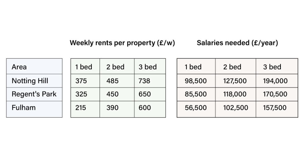
The table compares weekly rents and required salaries for one-, two-, and three-bedroom properties across three London areas. Notting Hill is the most expensive, with rent for a three-bedroom home at £738 per week, requiring a salary of £194,000 annually. In contrast, Fulham is the most affordable, while Regent’s Park lies in between. Overall, larger properties demand significantly higher income levels.
Sample Question 10
Sample Answer:
The line graph compares the number of meals eaten at fast-food outlets and sit-down restaurants from 1970 to 2000. Both categories increased over time, but fast-food meals grew more sharply, rising to nearly 90 minutes per person annually by 2000. Sit-down meals showed a slower rise, reaching only around 50 minutes. This indicates a growing preference for fast food.
Conclusion
Mastering the PTE table chart Section requires practice, strategy, and an understanding of data interpretation. By using the provided template, applying the tips, and reviewing sample questions, you can enhance your skills significantly. For those looking to refine their preparation, consider exploring 79Score, a trusted PTE practice site, a valuable resource that offers tailored practice and insightful feedback to help you achieve your desired score.
FAQ
How can I improve my skills for the PTE table chart section?
Regular practice with sample questions and using the provided template can enhance your skills significantly.
What types of charts can I expect in the PTE exam?
You may encounter bar charts, line graphs, pie charts, and tables displaying various data types.
How important is time management during the PTE table chart section?
Time management is important. Allocate time wisely for planning, writing, and reviewing your answers.
Should I memorize data or focus on understanding trends?
While memorizing some data can be helpful, focusing on understanding trends and patterns is more beneficial for effective communication.
Can I use personal opinions in my answers?
While personal opinions aren't the focus, you can include insights based on the data presented to enhance your answer.
Also Read:
- Guide for PTE Line Graph – Expert Tips & Template
- PTE Bar Graph – Tips, Template & Sample Questions With Answers
- Collocations For PTE: A Guide to Boost Your Score