
|
79Score
Getting your Trinity Audio player ready...
|
PTE Describe the image question type is the third prompt type in the real PTE exam, which tests your ability of how well you describe the key points of the image in a short period. This question is the easiest part of the speaking section if you prepare well, and you are aware of the tips and tricks to tackle this question type. It allows 25 Seconds time to prepare and jot down the key points from the given image, and then once the beep sound plays you have to start describing the image for 40 seconds. It is quite chaotic if you are not very well prepared with the structure of describing an image properly so here are type of PTE describe image.
If you want to check your level of preparation before appearing the PTE mock test or the PTE test, free PTE practice will come in handy to highlight your mistakes and improve on them.
Type of PTE Describe Image:
In the PTE exam, you will encounter with different type of PTE describe image, such as:
Bar Graph:
A bar graph displays data using rectangular bars, either horizontally or vertically. It compares different categories based on numerical values.
Tips for Bar Graphs:
✅ Identify the highest and lowest values.
✅ Compare trends: Are the bars increasing, decreasing, or fluctuating?
✅ Use comparative phrases like “X is higher than Y,” “The lowest bar represents…”
✅ Mention units if available (e.g., percentage, population, sales figures).
Example:
“The bar graph illustrates the sales of three products over five years. The highest sales were recorded in 2020, while the lowest was in 2018. The trend shows a steady increase in sales over time.”
Line Graph
A line graph shows trends or changes over time using lines connecting data points. It is often used to represent growth, decline, or fluctuations.
Tips for Line Graphs:
✅ Observe the starting and ending points of the line(s).
✅ Identify trends: Is it rising, falling, or fluctuating?
✅ Use terms like “a sharp increase,” “a gradual decline,” “a sudden drop.”
✅ If there are multiple lines, compare them briefly.
Example:
“The line graph represents the unemployment rate from 2010 to 2020. Initially, the rate was 5%, rising sharply to 10% in 2015. After that, it gradually declined to 4% by 2020.”
Not sure where you stand? Take a free PTE mock and find out instantly

- Get a complete performance breakdown instantly
- Access 30,000+ Free Question Wise Practice
Table
A table organizes numerical data into rows and columns for easy comparison. It usually includes multiple categories.
Tips for Tables:
✅ Identify key differences between categories.
✅ Focus on the highest and lowest values.
✅ Compare trends if data is presented over time.
✅ Avoid reading all the numbers—just highlight key points.
Example:
“The table shows the population of five cities in 2020 and 2025. The highest population growth was recorded in City A, while City C saw a slight decline.”
Maps
A map presents geographical locations, directions, or changes in a place over time.
Tips for Maps:
✅ Identify key landmarks, directions, or changes (before/after).
✅ Use spatial words like north, south, adjacent to, opposite, near.
✅ Compare two maps if shown (e.g., past vs. present).
Example:
“The map shows the city layout in 2000 and 2020. Over time, a new bridge was added in the north, and the park area was expanded.”
Pie Chart
A pie chart represents data as proportions of a whole (100%). Each section represents a percentage.
Tips for Pie Charts:
✅ Identify the largest and smallest sections.
✅ Compare sections: Which category dominates?
✅ Use percentages in your response.
Example:
“The pie chart represents the market share of different car brands in 2023. Brand A holds the largest share at 40%, while Brand C has the smallest share at 10%.”

Flowchart Diagram
A flowchart shows steps in a process using arrows and symbols.
Tips for Flowcharts:
✅ Identify the starting and ending points of the process.
✅ Describe each step briefly.
✅ Use words like “first,” “next,” “then,” “finally.”
Example:
“The flowchart illustrates the online order process. First, the customer selects a product, then adds it to the cart, makes the payment, and finally, the order is shipped.”
Venn Diagram
A Venn diagram consists of overlapping circles showing similarities and differences between two or more categories.
Tips for Venn Diagrams:
✅ Mention what is unique to each category and what is common in the middle.
✅ Use words like “only,” “both,” “common features.”
Example:
“The Venn diagram compares apples and oranges. Both are fruits and rich in vitamins, but apples contain fiber while oranges have more Vitamin C.”
Pictures
A picture may depict people, objects, a landscape, or an event.
Tips for Pictures:
✅ Identify the main subject (What is happening?).
✅ Mention colors, expressions, actions, surroundings.
✅ Use present continuous tense (e.g., “A man is walking,” “Children are playing”).
Example:
“The picture shows a busy marketplace where people are shopping. A woman is selling vegetables, and children are playing nearby.”
A total of six different images will be asked about during the PTE academic exam. Let’s look into a template you should follow to improve your PTE describe image score. First, we will look into what PTE requires of the test takers. The PTE evaluation algorithm will look into sentence formation and paragraph formation. A description of any image or thing is only completed with three ingredients. First is the introductory statement, second is the key highlight point, and third is the conclusion. If you have included these three points while describing the image, chances are high that the PTE algorithm will give you better marks than the image described randomly. In the PTE, which represents an image, your response is judged based on oral fluency and pronunciation. Let’s look at the format that you should remember for the described image:
PTE Describe Image Template:
Introduction (1 sentence):
- The given image is a (bar chart/line graph/pie chart/diagram/map/table) that illustrates (mention the main topic).
Key Features (2-3 sentences):
- The image presents information about (describe the main trend or pattern).
- The highest (or lowest) value is observed in (mention category) with (mention value if applicable).
- There is a significant (increase/decrease/variation) in (mention any noticeable trend or change).
Comparison/Trends (1-2 sentences):
- Comparing different elements, (mention similarities or differences).
- A notable trend is that (describe any major change or outlier).
Conclusion (1 sentence):
- In summary, the image provides valuable insights into (restate the main theme briefly).
Sample Answer to Describe image
Answer:
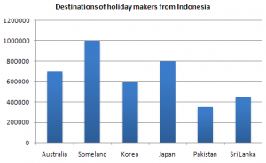
The given bar graph gives information about the destinations of holidaymakers from Indonesia to various countries such as Australia, Someland, Korea, Japan, and so on. It is clear that the highest number of tourists from Indonesia visited Someland, which is around 1000000 tourists. The least visited tourist destination amongst all is Pakistan, where just around 300000 people stayed. Overall, Someland is the most favorite destination amongst visitors.
Bonus Tips and Tricks For All Types of PTE Describe Image:
- Avoid ‘umming’ and ‘urring’ while speaking. This will reduce your oral fluency and overall marks.
- Remember to avoid grammatical mistakes while forming the sentence.
- Prepare this structure and practice over and over again to speak automatically in this format. Remember our previous blog where we discuss the proper practice. Read how to get 79+ score in the PTE exam
- Practice the speaking in format below
- 10 Seconds for introduction
- 20 Seconds for highlighting key points
- 6 Seconds for conclusion
- Don’t try to speak for a full 40 seconds. Stop before the 36 Seconds because if you extend your speaking for 40 seconds, you might miss the conclusion and lose the marks.
- After the introduction is completed, the next step is to explain the graph’s highlighting factor. You can go to the highest factor and the changing trends within the years mentioned. If you see any constant factor, the lowest factor in the image, you can explain that too. But try to explain it within 20 seconds. Try to speak clearly without getting confused between the task. Remember one thing: SPEAKING IN FLUENCY AND PRONUNCIATION =TO SUCCESS.
- The most important PTE Speaking Describe image tips are practicing and being prepared with the template. You can use your free PTE mock test with evaluation to implement these tips. There will be 3 to 4 PTE describe image questions in the PTE exam; however, if you wish to practice just this question, you can opt for PTE question-wise practice test. The mock PTE test will allow you to maximize your overall score in the PTE exam.
Overall, to improve all type of PTE describe image scores, the key point is to practice and be precise with your template, which will give you a higher score. Experience real-time exam simulations on 79Score and master the actual test format. Practice with section-wise tests& do question-wise practice featuring instant scoring and full-length mock exams to boost your score. Stay updated daily—join our Telegram channel and follow us on social media!
Also Read: